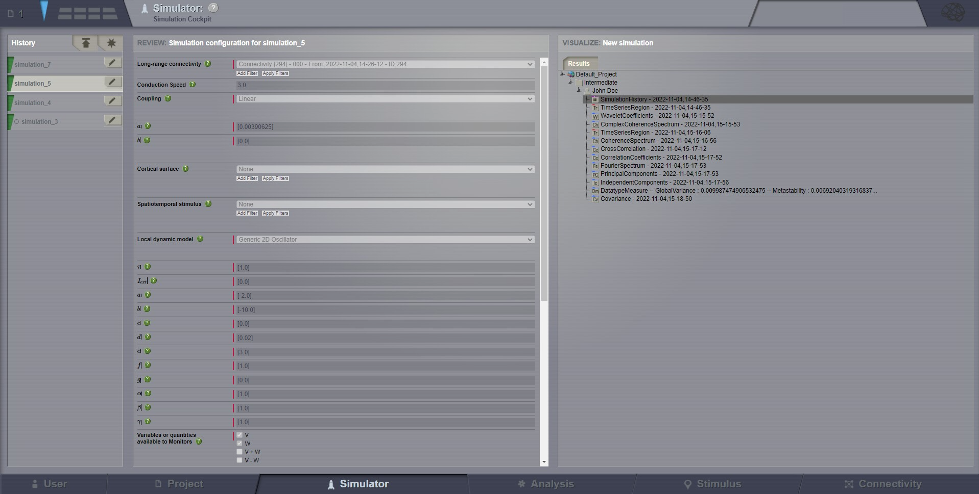
We call History the most left column on the Simulator page. Along with the History title,
you can observe two buttons on the top bar of this column.
The button allows you to initialize a new simulation, using the default Simulator
parameters. This default initialization is already happening, if you just landed on this page
for the first time. The button can be useful in case you started configuring a complex simulation
and you lost track of the changes, to return to the safe defaults.
The button allows you to upload a ZIP file. This file can be exported from a previously
configured and run simulation (on the same or different TVB installation, as long as versions are compatible).
Details on how to export such a ZIP file can be found just bellow, when we explain the icon.
As main content in this left column, a history of all simulations is kept and can be
accessed at any time.
Each simulation execution has a color label that represents its current status:
pale blue: simulation is running,
green: simulation is finished,
gray: simulation has been canceled by the user,
red: an error occurred during the simulation.
Each simulation can be renamed, copied, exported or deleted by clicking on icon, next to its name.
To rename a simulation, click the icon first, then edit the text in the input field,
and do not forget to press icon when you are done writing.
Note
You cannot rename a Simulation while it is running, but instead you could cancel it
(e.g. if you see it eats too many of your machine resources, or you simply changed your mind about this run).
Copy simulation means loading in memory the same configuration, as used for that particular simulation.
It will be your job to optionally change something in the configuration and, when done, press the icon,
to actually run this copy of the simulation.
Export ZIP is a new feature which allows you to create a zip file, which stores the current simulation
information (datatypes, models, integrators, etc, in H5 format). This zip file will be downloaded from your browser window, and can be reused later. You could use it
on the same TVB installation, or on a totally different TVB server, in several manners:
from web GUI, using the button, on this page (top of column History)
in the python console of TVB, for better debugging capabilities. Examples for this later case can be
found in the set of examples for COMMAND and LIBRARY profiles.
Caution
Please notice that deleting a simulation will remove the parameters configuration, and also delete all
resulting data that had been produced in relation to that simulation.
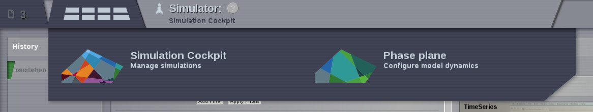
It is used to explore and define parameter configurations.
It is accessible from the top menu:
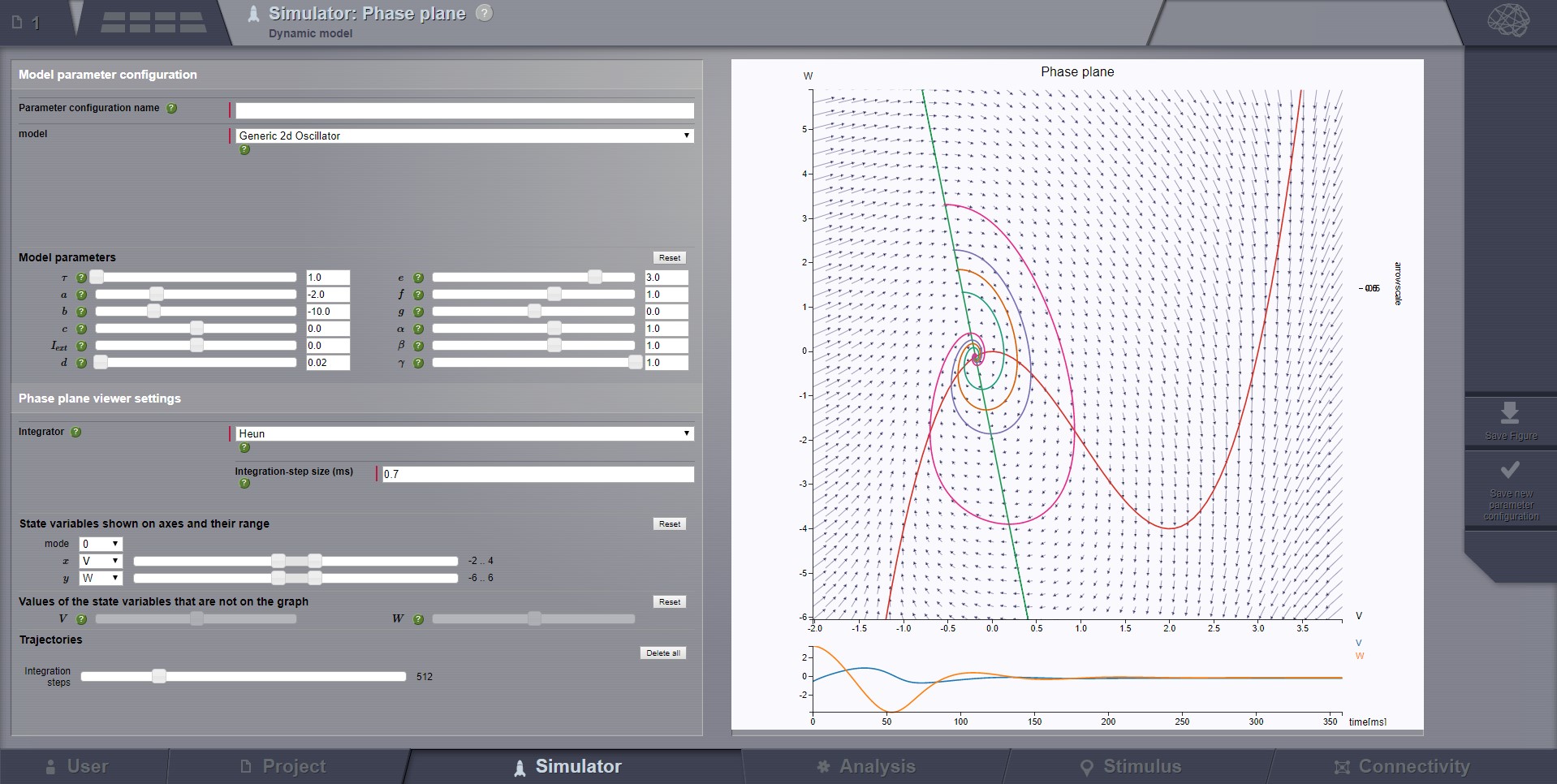
This page allows you to observe how the dynamics of the physical model change as a
function of its parameters.
On the left column you select the model you want to explore and set it’s parameters.
The selected model will generally have a n-dimensional phase space.
The right column shows a 2-dimensional axis cut of this space. Gradients are shown and nullclines if they exist.
To control this cut use the Axes and State variables regions in the left column.
There you can select what state variables should be shown and their ranges.
Also you can set values for the variables that are not shown.
If you click in the phase plane a state trajectory will be computed.
The integration method for this trajectory is configured on the left column.
To make trajectories longer increase the integration step. This will not influence the simulation.
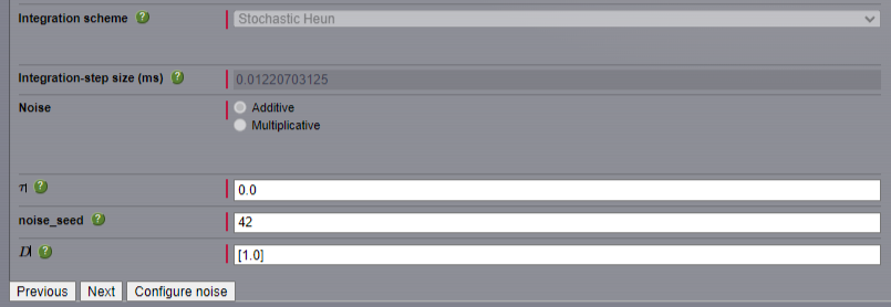
For stochastic integrators decreasing the dispersion usually makes sense.
Below the phase graph you will see the signals for all state variables. These signals belong to the latest trajectory.
Finally to save a parameter configuration give it a name and click Save new parameter configuration.
This saved configuration can be used in Region-based simulations
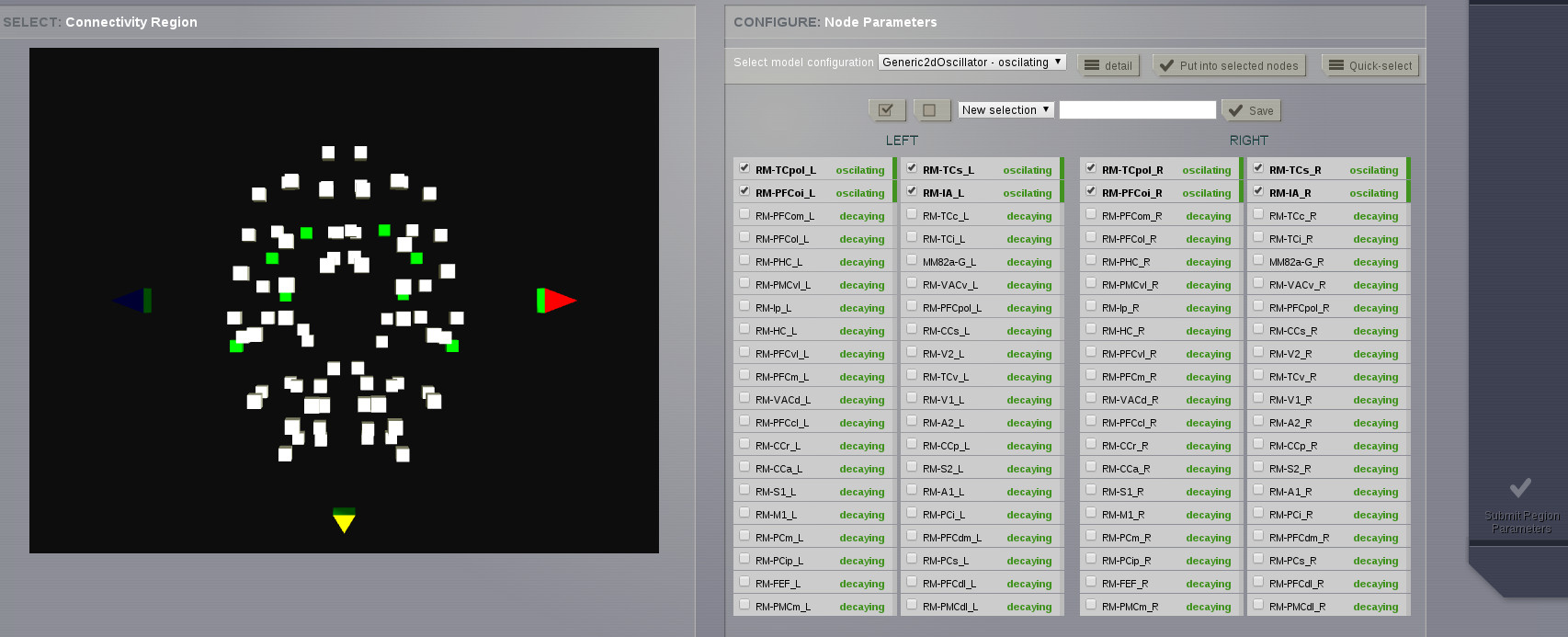
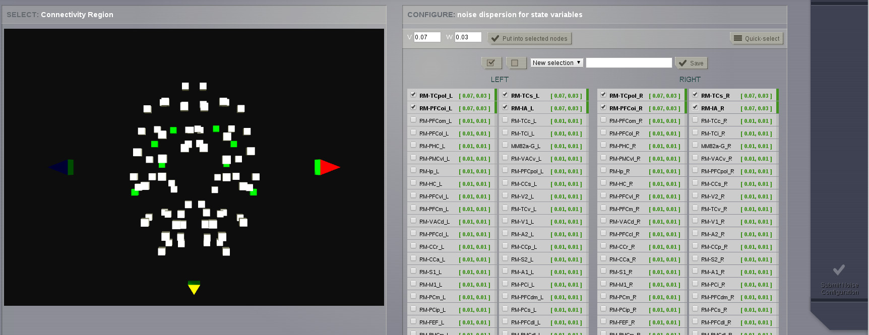
The Configure noise button leads to the region noise page.
Here you can associate noise dispersions to connectivity nodes.
Select some nodes using any of the selection components or the 3d view.
Choose dispersions for all state variables then place those values in the selected nodes.
It is possible to launch parallel simulations to systematically explore the
parameter space of the local dynamics model. In the current TVB version, up to
2 parameters can be inspected at the same time.
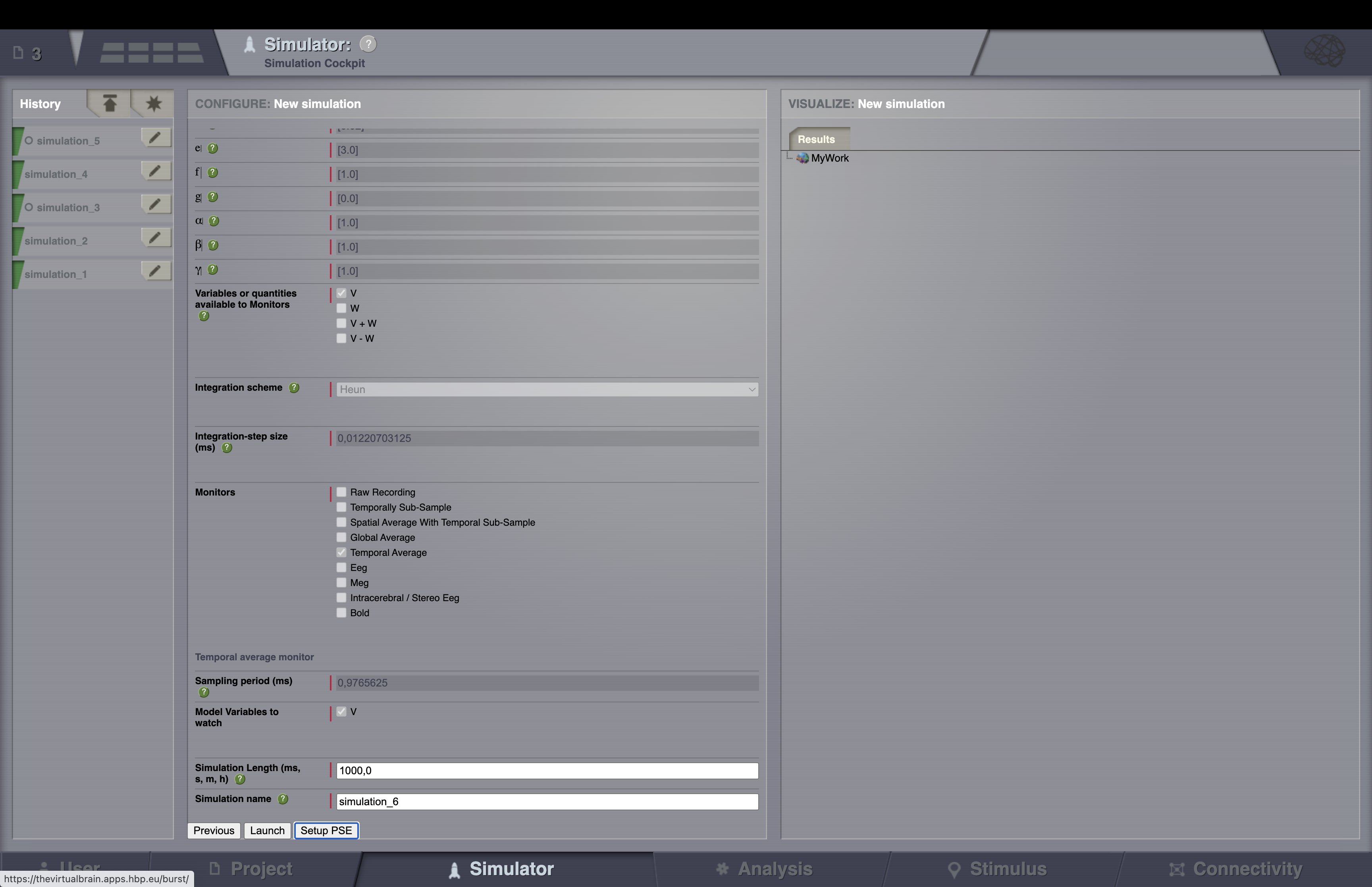
Launch a PSE at the end of configuring a simulation.
A PSE results will be presented in a discrete two dimensional graph. Each
point represents the results of a simulation for an unique combination of
parameters. The disk size corresponds to Global Variance and the color
scale corresponds to Variance of the Variance of nodes.
On the right column you will find an area where you can configure displays to exhibit
your simulation results.
Hint
Maximize this column by clicking on the zoom icon located in the top right
corner.
There are 4 tabs:
three View tabs you can set up by selecting:
TVB time-series Visualizers that directly plot the resulting time-series or
TVB-Visualizers associated with a TVB-Analyzer. In this case, simulation
results undergo two steps: they are first analyzed and those secondary results
are shown in a corresponding visualizer.
one Results tab containing the current simulation data structure tree. You
can inspect each element through this tree in the same way as in
Projects –> Data Structure.
A full list of visualizers and analyzers is available from the component
overlay menu.
Tip
Once your results are available, by clicking on you will be
redirected to a new page where only the currently selected visualizer is
presented. In this new page, you can click on in the top right corner
to access a new menu which will allow you to:
Save a snapshot of the current figure.
Relaunch the visualizer using a different entity, if available. For instance, a
different time-series.
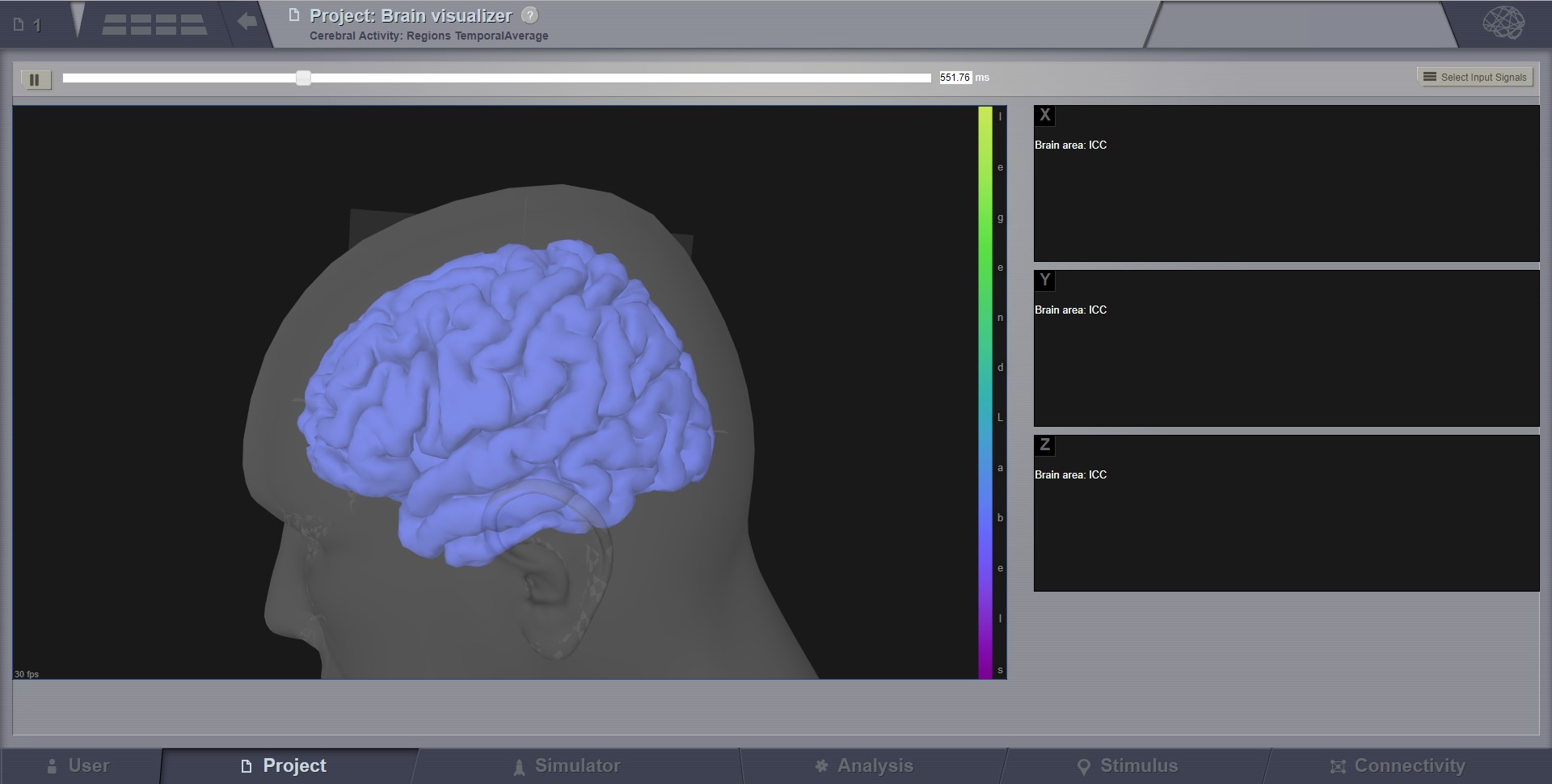
You can change the view by pressing a mouse button and dragging it.
the left button rotates the brain around the center of the screen.
the right button translates the brain.
the middle button and the scroll wheel zoom towards the center of the screen.
Pressing the shift key and the left button has the same effect as the right button.
Pressing the control key will rotate or translate in the model space; while without control key pressed,
the rotation happens in the space of the navigator (with center in (0,0,0) ).
The SPACE key will show a top view. The CURSOR Keys will show axis aligned views.
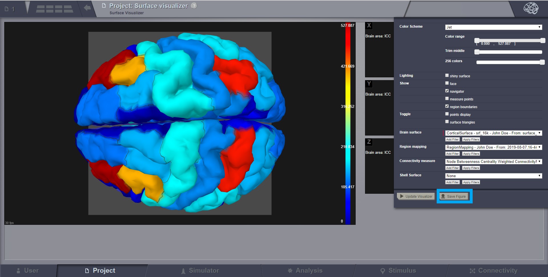
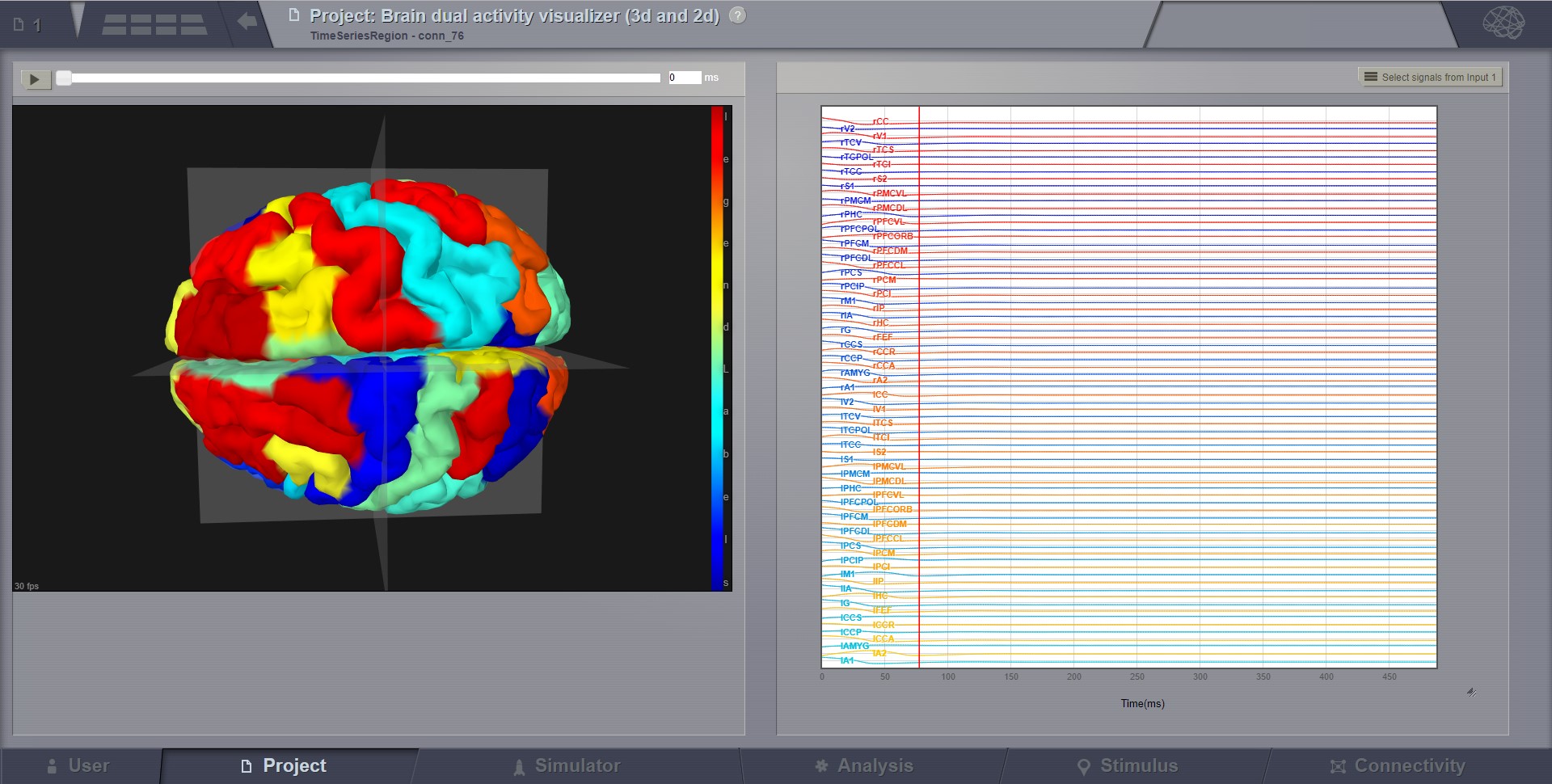
For region level time series the brain is represented by a coarse granularity - each
region is represented with only one color. For surface level time series each vertex
has an individual measure.
The color coding is determined by the current color scheme. A legend of it is on the right side of the brain view.
You can change this color scheme and other viewer parameters from the brain menu in the upper right corner.
From the visualizer toolbar you can pause and resume the activity movie.
For region level time series there is a selection component in the toolbar.
Use it to show activity only for the selected regions.
Preview for Brain Activity Visualizer at the region level
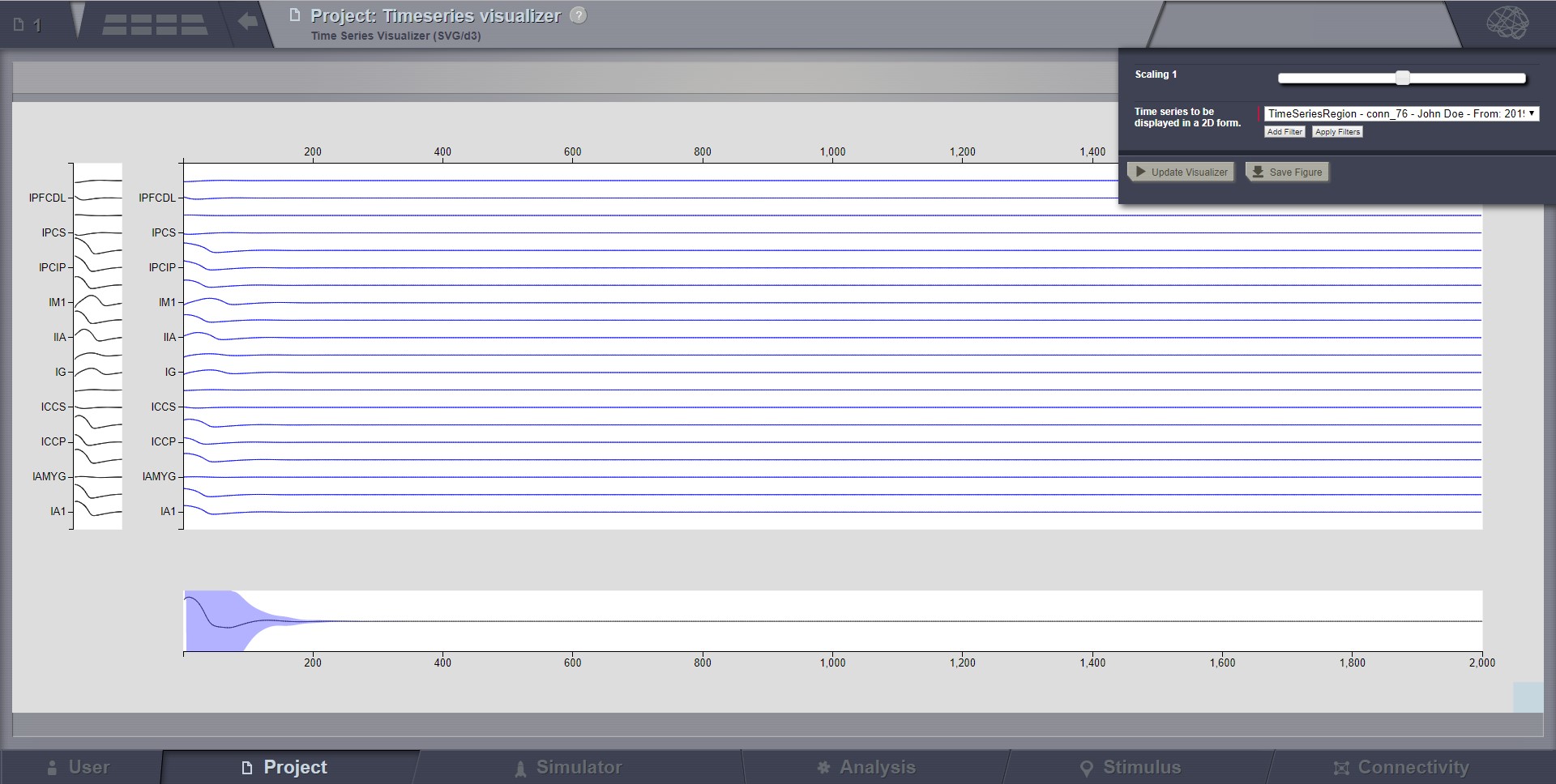
In the center area you click and drag to zoom, click once to reset zoom and use the scroll wheel to scroll signals.
The horizontal bottom part is the temporal context. Here the solid line marks the mean across channels, in time.
The shaded area marks standard deviation across channels, in time.
You Click and drag to select a subset of signals. The selection can be changed again by dragging it.
Click outside selection box to cancel and reset view.
You can resize the view by dragging blue box in the bottom right corner.
The vertical left part is the signal context. Here solid lines show each signal. Selection works like in the temporal context.
In the brain menu there is a slider you use to change the signal scaling.
The label “animated” comes from the red line which will pass the entire signal step by step, at a configurable
speed. In single mode, this red-line might not be very useful, but it makes more sense when the same 2D display
gets reused in the Dual Visualizers (combined with the 3D display on a surface) where the red-line shows the
current step displayed in the 3D movie on the left.
Select zoom area with your mouse (you may do that several times to zoom in further).
From the toolbar you can pause resume the activity and zoom out.
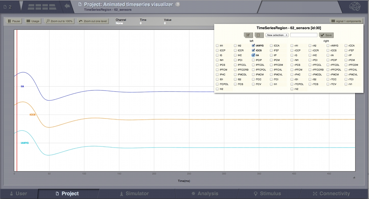
This viewer can display multiple time series.
On the right side of the toolbar there will be a selection component for each signal source.
These selection components determine what signals are shown in the viewer.
To select additional time series use the brain menu in the upper left corner.
From that menu you can change viewer settings. The page size determines how much data should appear at once in the viewer.
The spacing determines the space between the horizontal axis of each signal. Setting it to 0 will plot all signals in the same coordinate system.
A side effect of this setting is that as you decrease this axis separation the amplitude of signals is scaled up.
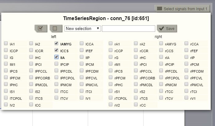
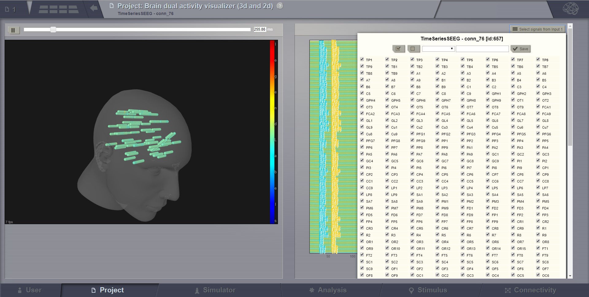
Selecting the “channels” to be displayed (available in several viewers of TVB).
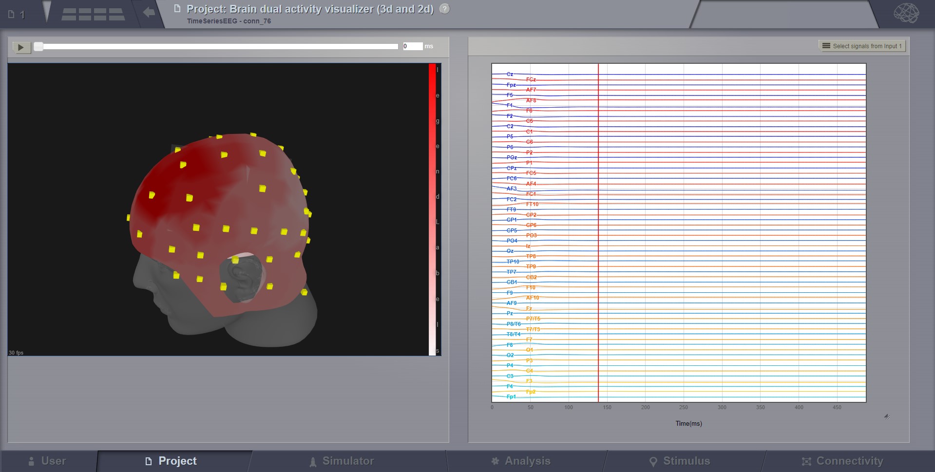
This visualizer combines the brain activity movie shown in a 3D display on the left,
with the explicit channels recording lines on the right.
Movie start/stop, speed control, color schema change, channel selection are some of the features available in this visualizer.
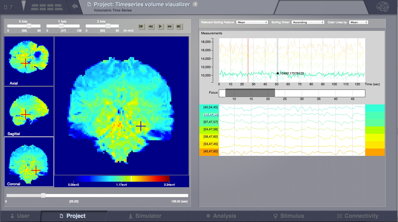
This family of viewers display volumetric data, usually in an anatomical space.
If the data has a time component then on the right side it will display timelines for selected voxels.
FMri data is an example of this.
A structural mri volume may be used as a background.
There are 3 navigation and viewing quadrants on the left and one main “focus quadrant” (left-central).
It is possible to navigate in space using the slide controls on the
top-left toolbar or by clicking on the 3 navigation quadrants on the most left part of the screen.
So clicking in the 3 left squares will change the X, Y, Z of the planes slicing through the currently displayed volume
(as the sliders on top are doing), while clicking in the main (central) square will select the clicked point for display
of details on the right.
The crosses designate the selected voxel. It’s value is shown at the bottom of the focus quadrant. A white bar on the
color legend also indicates this value.
The playback function is activated by clicking the play button on the top bar,
and it will then change the display with time (left and right areas);
The time series data is buffered from the server according to the currently section of view.
A different color map can be selected by clicked the Brain call-out in the top-right side of the screen.
You might want to use the trim middle values feature with this viewer. It renders values around the mean transparent in the view.
Also to be found on the Brain call-out.
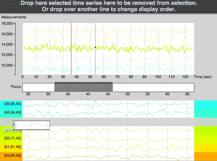
Time Series Line Fragments
This is the right part of the TimeSeries Volume visualizer and is composed of other sub-parts:
All selected lines are shown here (top area), with the same scaling. Some transparency is applied to
the lines and only one line is highlighted at a time. Highlighting can be done
by passing the mouse over the line on the global graph or by clicking the
selected line in the sortable graphs bellow. Vertical scaling is done based only on the
selected values and not on the complete data set. A red vertical line shows the
current time point (correlated with the movie in TimeSeries Volume section).
A blue line follows the mouse showing the value of the highlighted line at each point.
Time slice selection (focus):
This function can be used to display only a portion of the data, zooming on it bellow.
Try dragging in this region. The grey selection box can be moved and resized.
If the focused data looks flat, increase the selected window length.
The selection will automatically set itself around the current time point
with a default extent during playback.
Sortable Graphs:
Every selected time series from the volume is shown on a separate line and labeled
based on its coordinates from the 3D space.
Adding lines in this section can be done by clicking in the left area on the main quadrant.
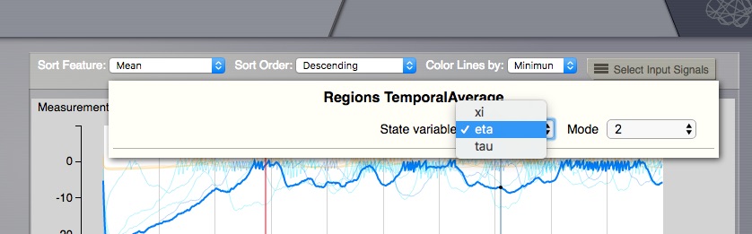
Display multi dimensional time series:
In case the Time Series displayed comes from a TVB simulation, when the Neuronal Mass Model
supports multiple modes and state-variables, then it is necessary to choose what to display,
as this viewer can only show 2D results. To choose from Mode and State Variable dimensions,
a selector will appear on the top-right area. When changing the selection, the coloring for
the left-side volume regions will change accordingly.
Time Series Volume - select when multiple dimensions
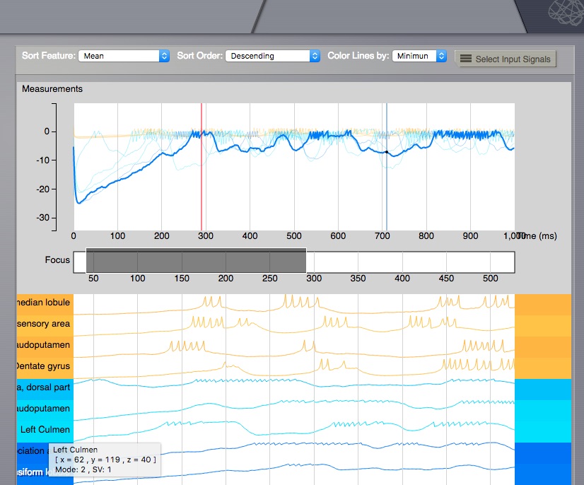
Already selected Time series lines on the right, will remain unchanged, when Mode and
State Variable change, but if you click again on the left side volume, new lines will
be added, for the currently active Mode and State Variable. One can inspect in the
line title, the details for that point (including X, Y, Z position in the volume,
full region name, Mode and State Variable).
While these time lines share the temporal axis they do not share the vertical one.
The signal amplitudes are dynamically scaled so as to make the signal features visible.
Amplitudes are not comparable among two of these signals.
The lines are colored following the selected feature
in “Color Lines by” at the top of the screen. They are then sorted automatically
by one of the selected methods or manually, by dragging and dropping each line
in the desired position, as seen on the picture bellow. Lines can be removed by
dragging them to the top “trash bin area” that appears every time a line is
selected to be dragged.
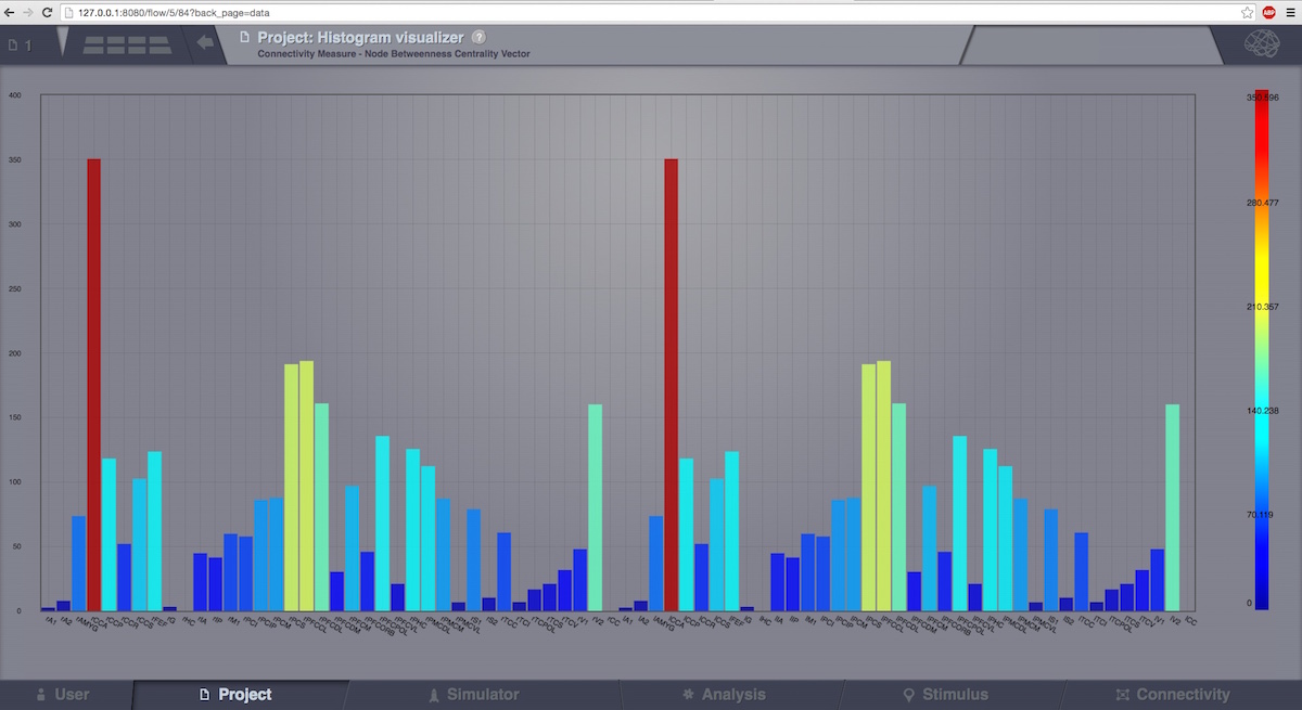
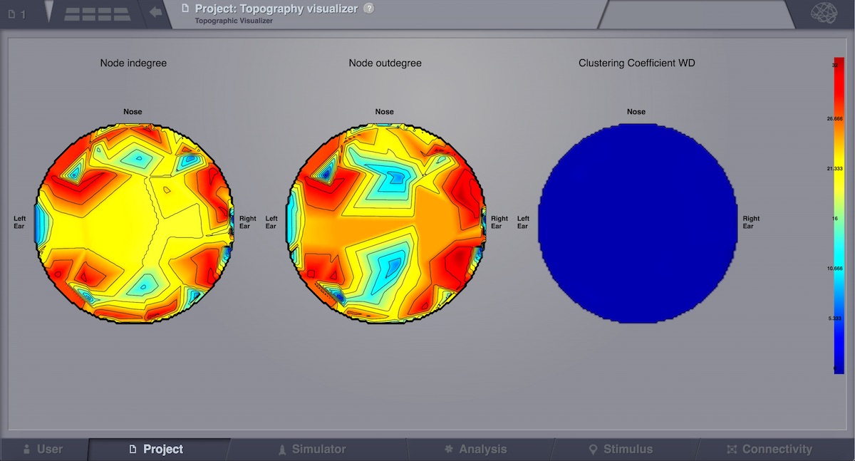
This visualizer can be used for displaying various Brain Connectivity Measures, related to a given Connectivity.
Its input is the same as for the previous visualizer (Connectivity Measure Visualizer), but the display is completely different.
Instead of a discrete view, this time, we can have a continous display (with gradients).
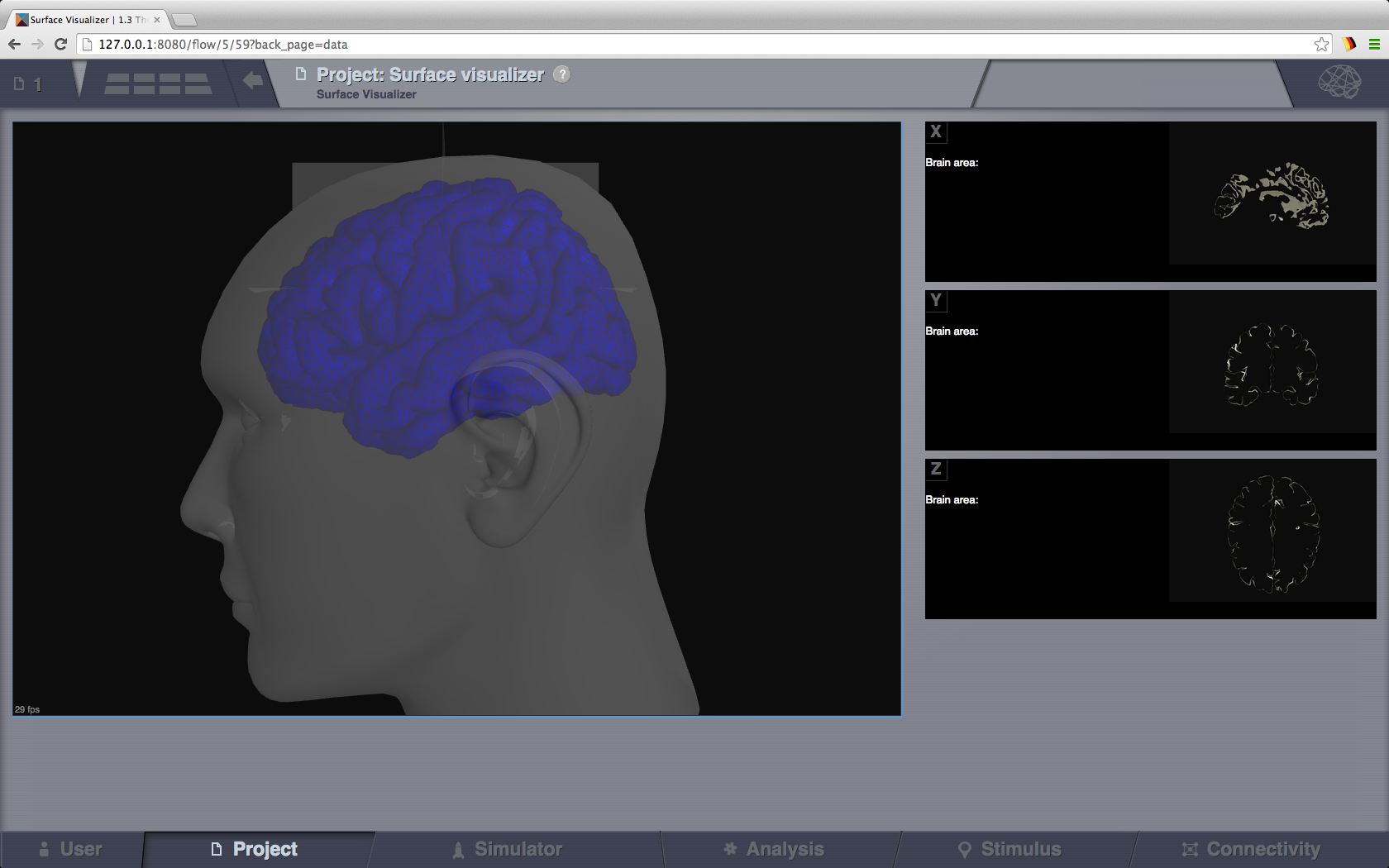
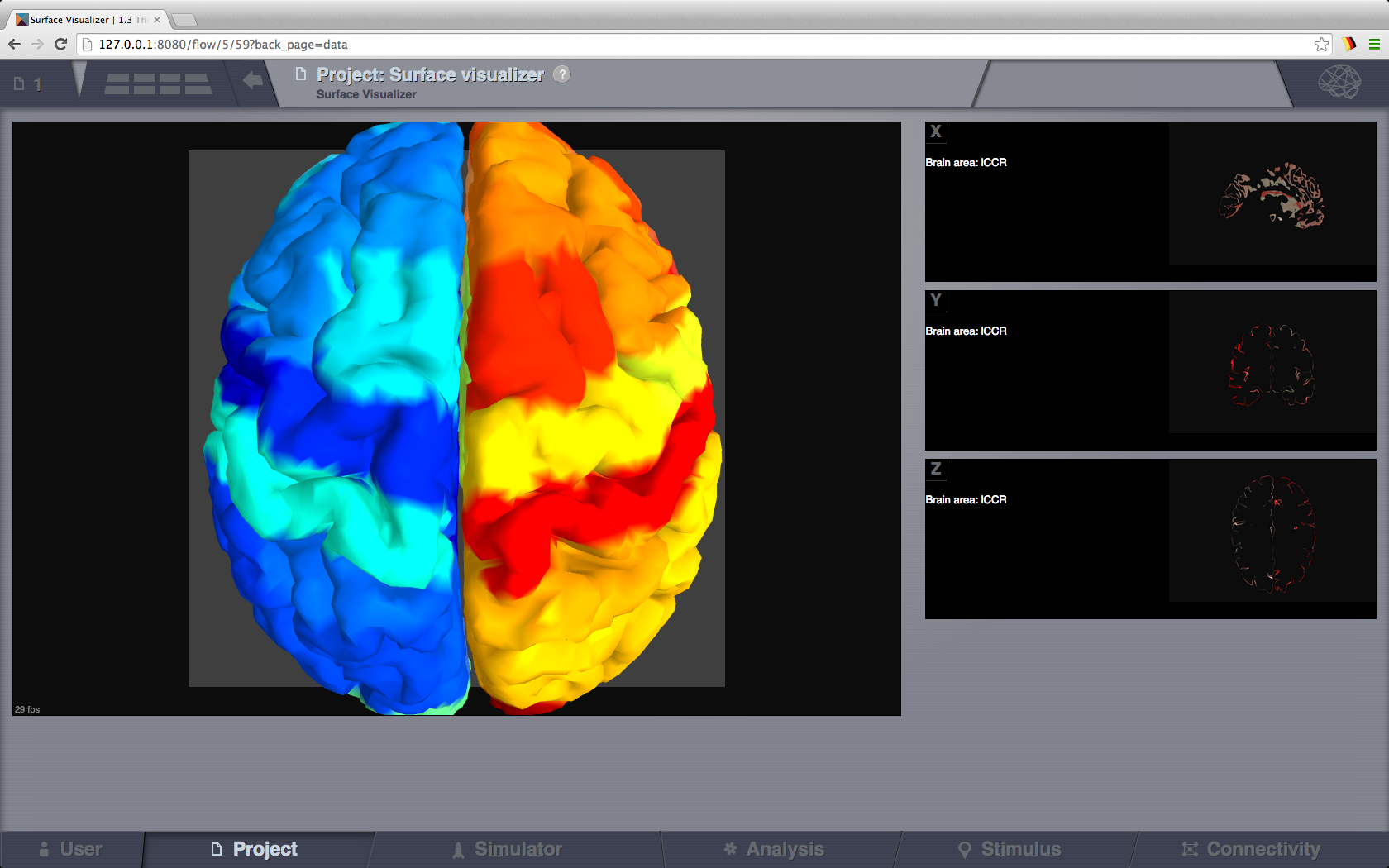
This visualizer can be used for displaying various Brain Surfaces. It is a static view,
mainly for visual inspecting imported surfaces in TVB.
Optionally it can display associated RegionMapping entities for a given surface.
Navigate the 3D scene like in the Brain Activity Visualizer.
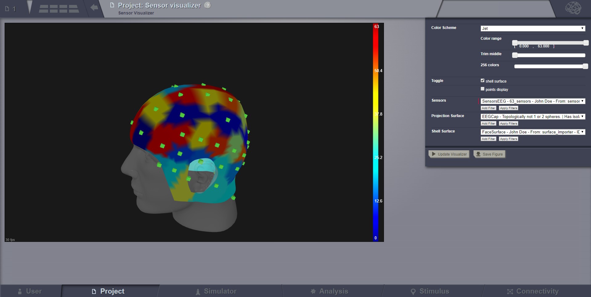
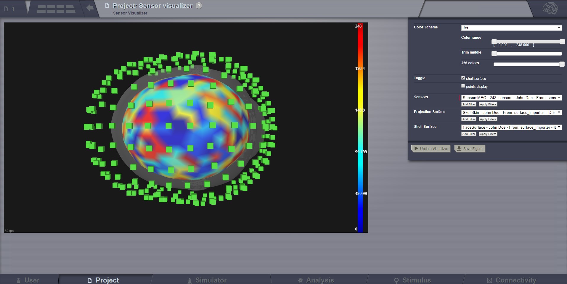
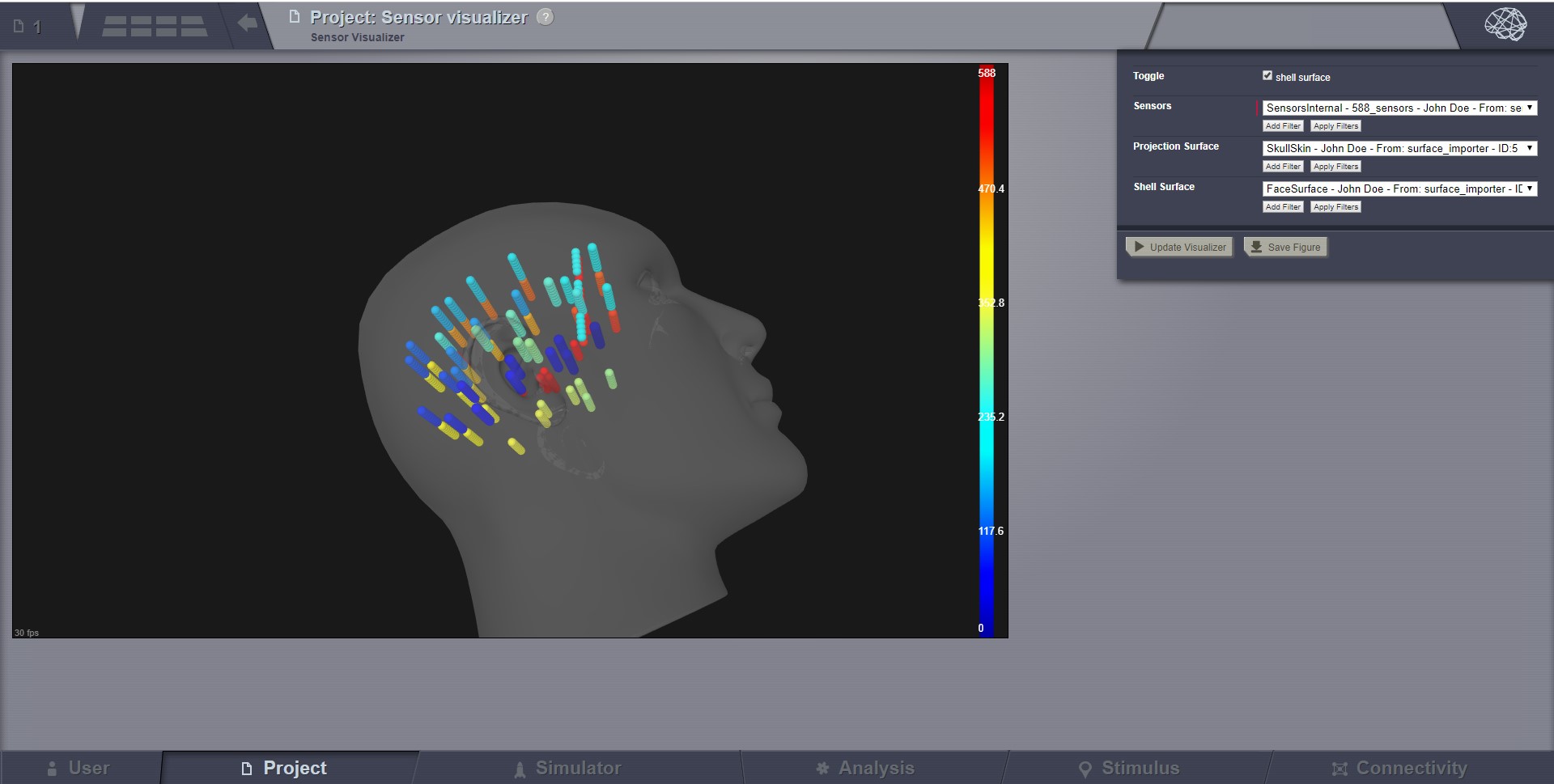
This visualizer can be used for displaying EEG, MEEG, and internal sensors .
It is a static view, intended for visual inspecting imported sensors in TVB.
Optionally it can display the sensors on a EEG cap surface.
To show sensors displaying on a Cap, check the call-out on the top-right corner.
When displaying the EEG sensors on a EEG Cap surface, we are automatically computing a “parcellation”.
Currently this parcellation has no anatomical meaning, it is only based on distance (a vertex gets coloured as
the closest sensor).
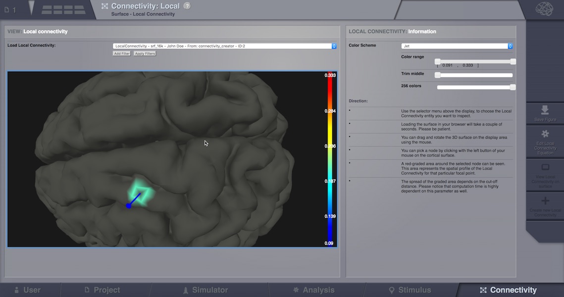
Once a Local Connectivity DataTypes (which in fact is a huge sparse matrix of max size surface
vertices x surface vertices, shaped after the cut-off) gets computed, one can view the correlation
of a given vertex compared to all its neighbours, by launching this viewer.
The Local Connectivity viewer can be launched from the DataType overlay (after clicking on a Local Connectivity
datatype, and then selecting TAB Visualizers), or from Connectivity (bottom page menu),
Local Connectivity option on top of the page, then select an existing LocalConnectivity and finally click “View”
from the right side menu.
In order to see actual correlations, one should pick (by mouse click) a vertex on the 3D cortical
surface once it loads in the canvas. The colors displayed nearby, show connected vertices with the
selected point.
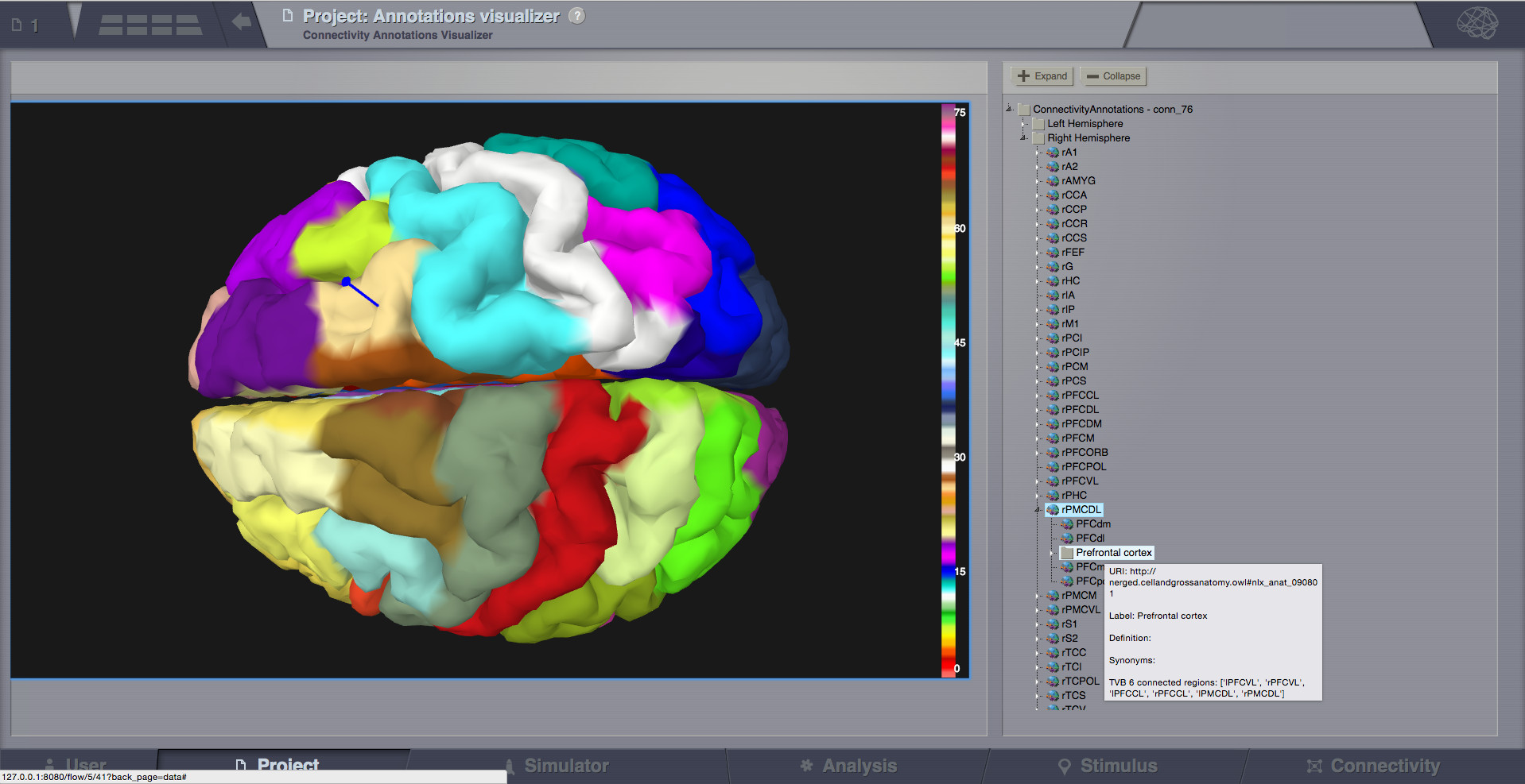
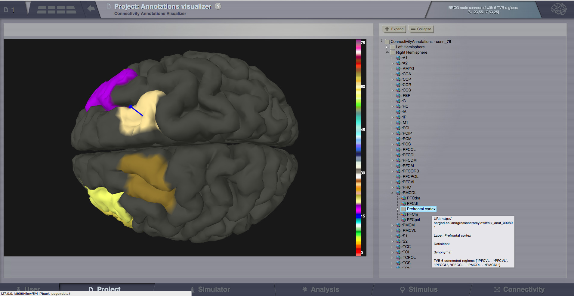
This viewer shows ontology annotations linked with TVB connectivity regions. It is composed of two main display areas:
3D left-side canvas with TVB regions. These regions are color coded, based on the connectivity region index
(similar to Surface Visualizer when a Region Mapping entity is selected). From the most top-right corner menu,
you can change the color scheme used to draw these regions coloring.
2D tree display of ontology annotations. A tooltip will appear if you go with the mouse over various nodes,
and will show you details imported from the ontology.
The two areas (left and right) are linked, both ways:
You can pick a vertex in 3D and have the corresponding tree node highlighted on the right-side, or backwards:
Click on the tree, and have the corresponding region(s) highlighted in 3D.
Pick a vertex in 3D and have the corresponding tree node selected on the right.
Hints:
There is a checkbox on the top-right menu to draw region boundaries in the 3D canvas
When you click on an ontology node on the right, a message text will appear on the top area of the page,
telling you how many TVB regions are linked to this ontology term
Select a tree node on the right, and have the linked regions highlighted in 3D.
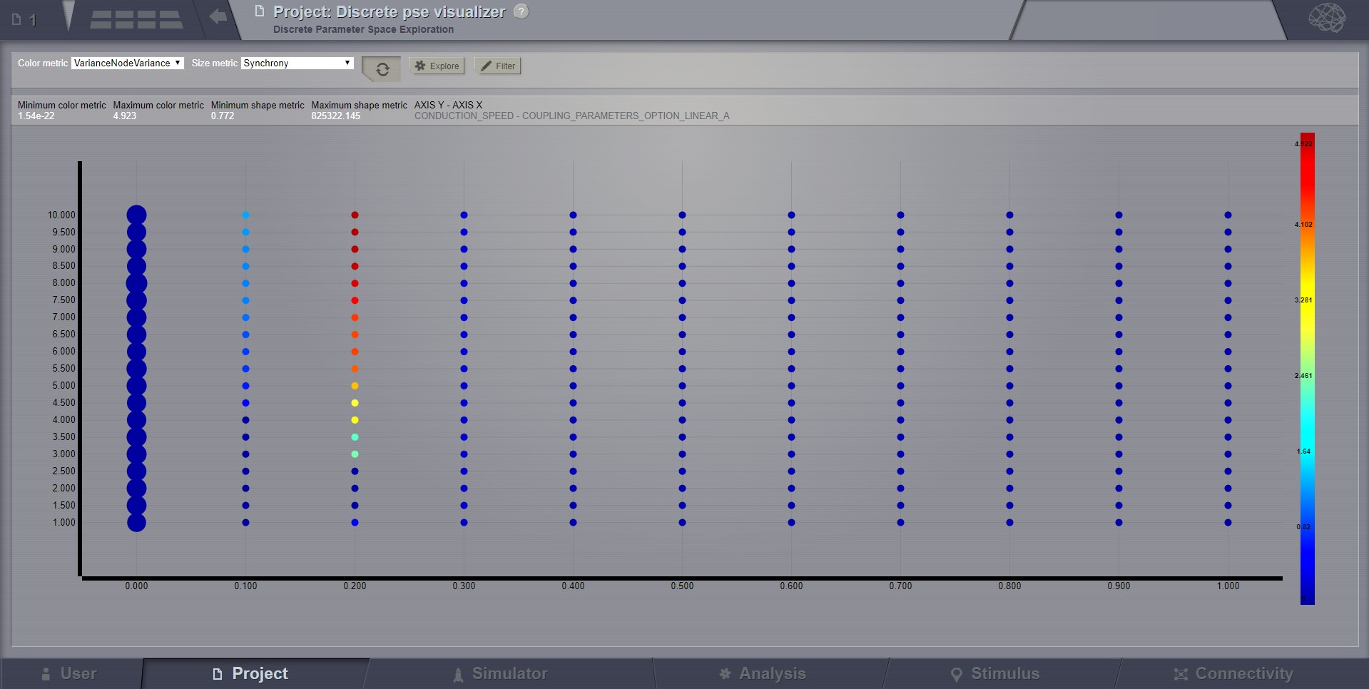
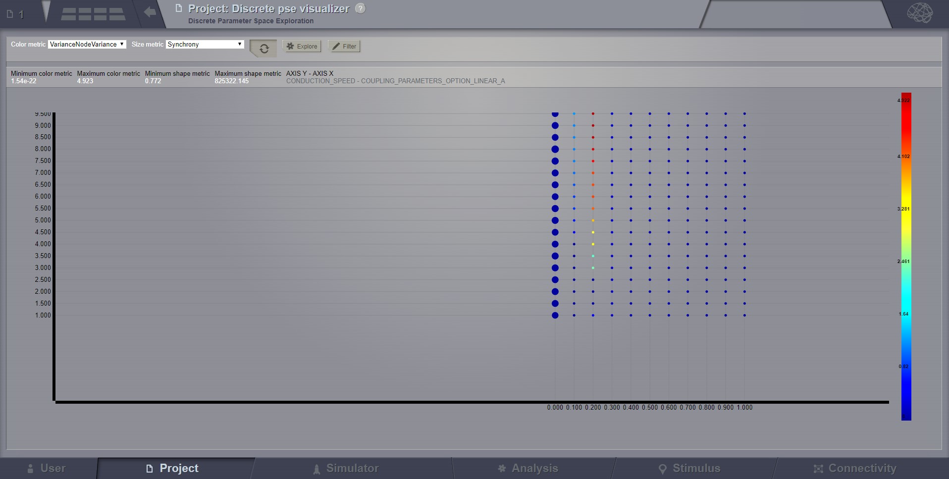
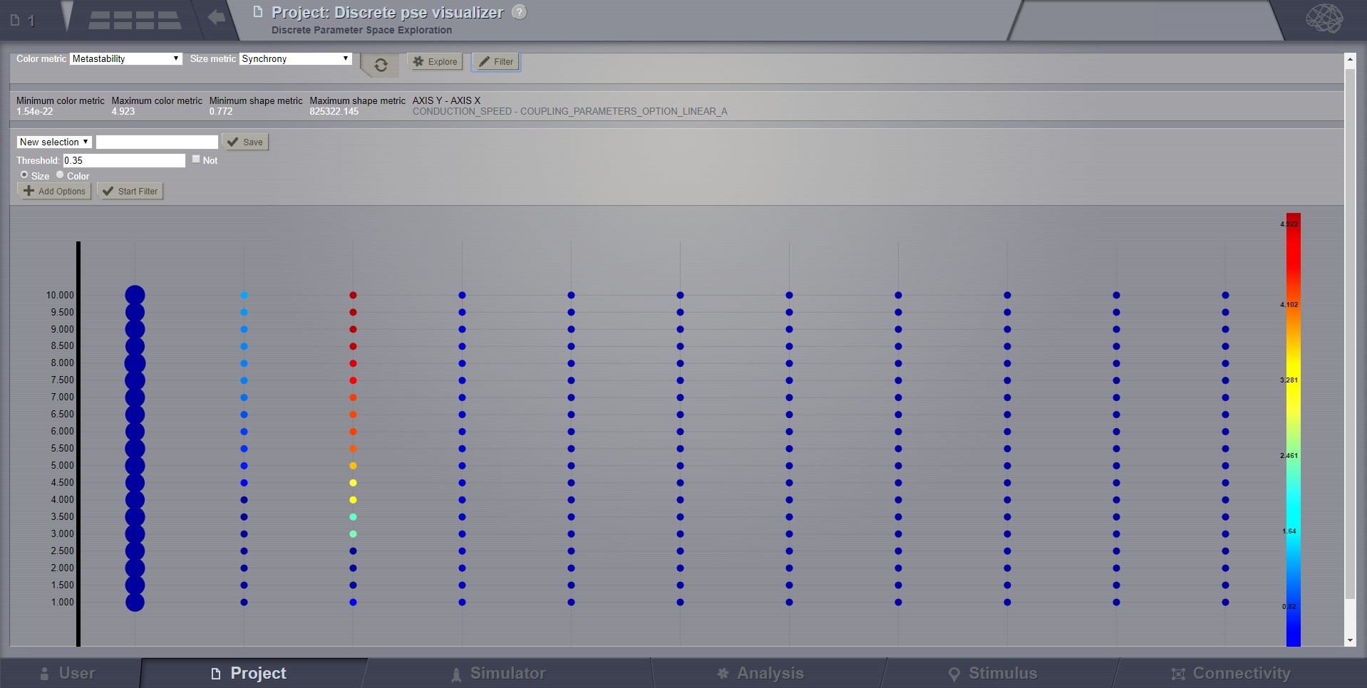
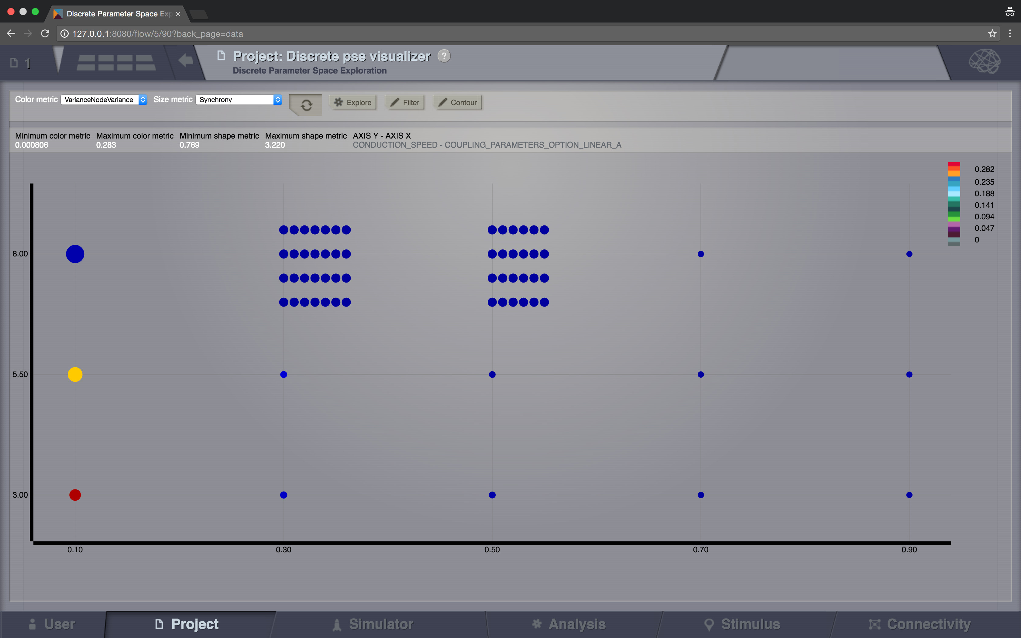
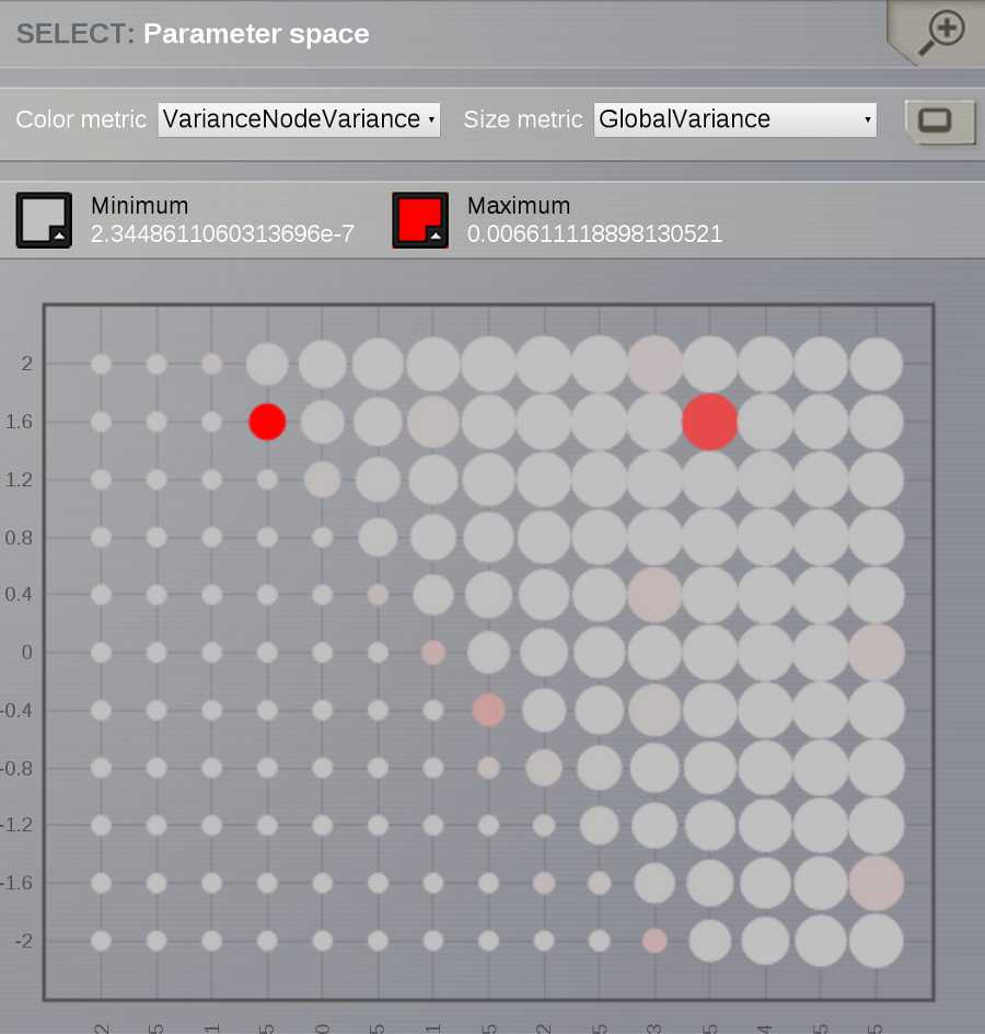
Discrete Parameter Space Exploration (PSE) View will show up information on multiple simulation results at once.
In TVB it is possible to launch multiple simulations by varying up to 2 input parameters (displayed on the X and Y axis of
the current viewer). Each simulation result has afterwards “metrics” computed on the total output. Each metric is a
single number. Two metrics are emphasized in this viewer in the node shapes and node colors.
When moving with your mouse cursor over a graph node, you will see a few details about that particular simulation
result. When clicking a node, an overlay window will open, which gives you full access to view or further analyze that
particular Simulation result.
Preview for Discrete PSE Visualizer, when varying two input parameters of the simulator
A newly incorporated feature is the option to pan the canvas in/out or left/right/up/down. To pan you may click and
drag on top of one of the axes, and to zoom in double click or out shift + double click. This will allow the inspection
of very large batch simulations section by section. The same mouse over, and clicking rules apply from above.
The next new tool is the filter button. This allows users to specify threshold values for either the color or size
metric and render results transparent if they are below that value. This tool has the option to invert the threshold
rule which makes the results above that threshold transparent instead. Also, the user has the choice to make their
filter more specific by adding further criteria rows that relate to the one which came before it through selected
logical operators (AND OR). It is worth noting that in order to perform filtering that requires grouping of the logical
operations ([foo and bar] or baz) as different from (foo and [bar or baz]) sequential filters must be applied:
one filter execution then the other.
(The Explore button is currently disabled because this functionality is not fully implemented)
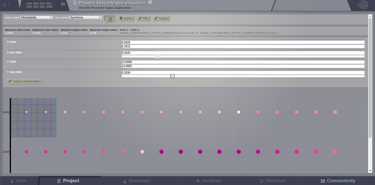
The last tool to be described in the PSE Discrete Viewer is the Explore tool. This tool is meant to give users the
option to select regions of the Parameter Space to be filled in with new results. Currently only the front end of this
tool is complete, so upon clicking the explore button the mouse cursor becomes a cross hair, and sections of the graph
can be selected. Upon creation of this selection, grid lines are placed to demonstrate where new results would be
added given the user’s chosen step values. To adjust these values simply drag the sliders in the drop down menu for
the explore tool, and the grid lines will adjust until they suit the user.
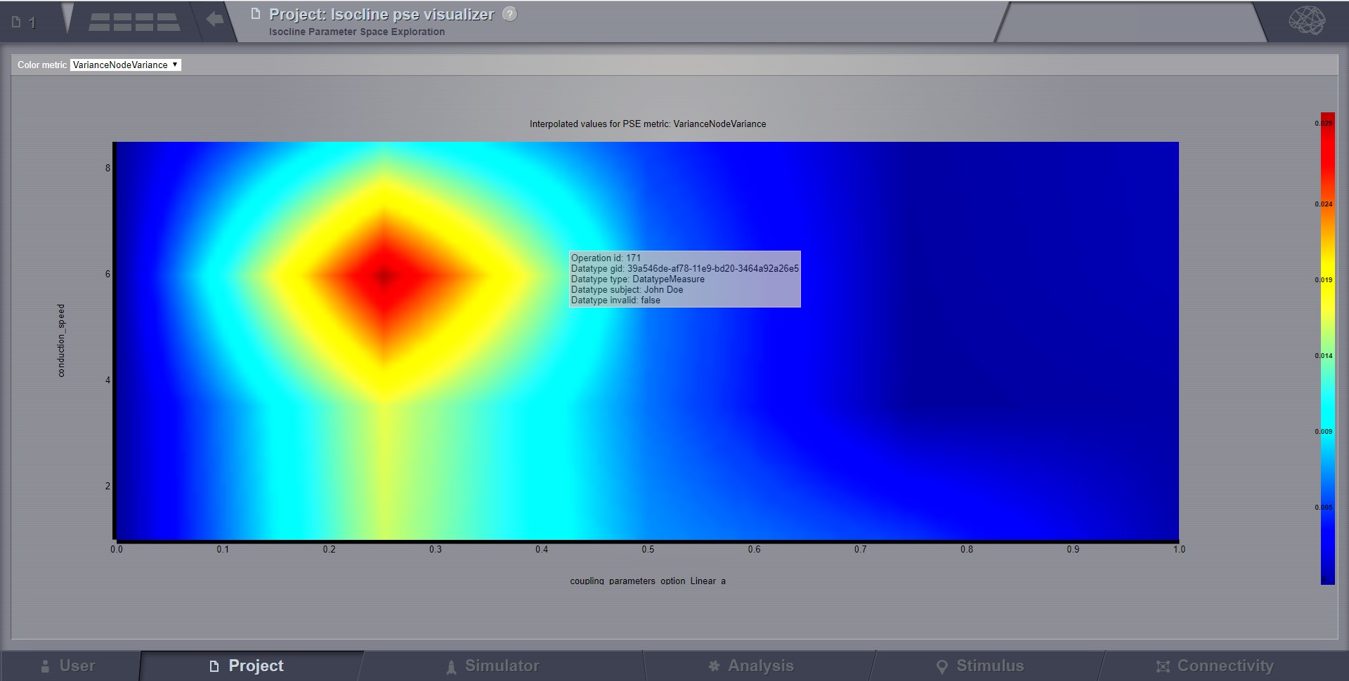
Continuous Parameter Space Exploration View, will show the effect of varying Simulator parameters in a continuous form.
When running a range of Simulations in TVB, it is possible to do it by varying up to 2 input parameters (displayed on
the X and Y axis of current viewer). This visualizer supports ranges with 2 dimensions only, it does not support ranges
with only one dimension. Also both varying dimensions need to be numeric parameters (no DataType ranges are supported
for display in this visualizer).
Preview for Continuous PSE Visualizer, when varying two numeric input parameters of the simulator
Controls for scaling or zooming the graph are available in this viewer. When you click on the coloured area, an overlay
window will open, having the possibility to view or further analyze the simulation result closest to the point where
you clicked.
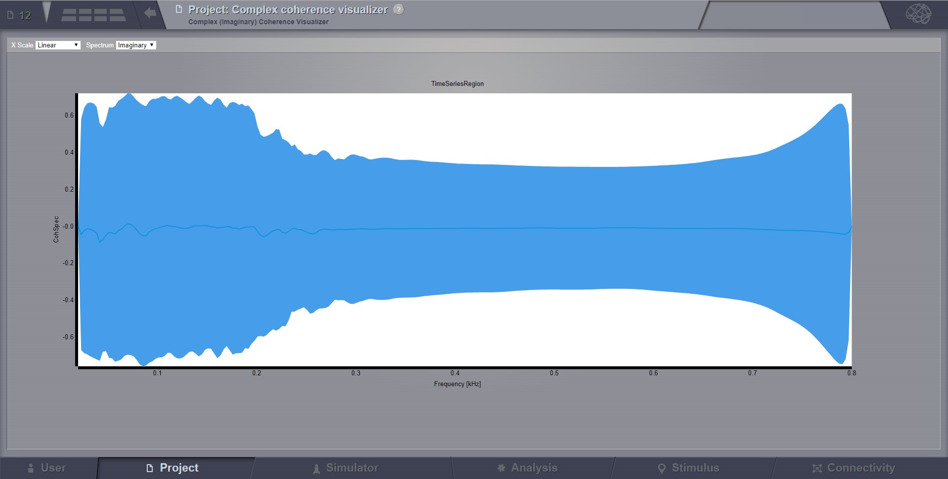
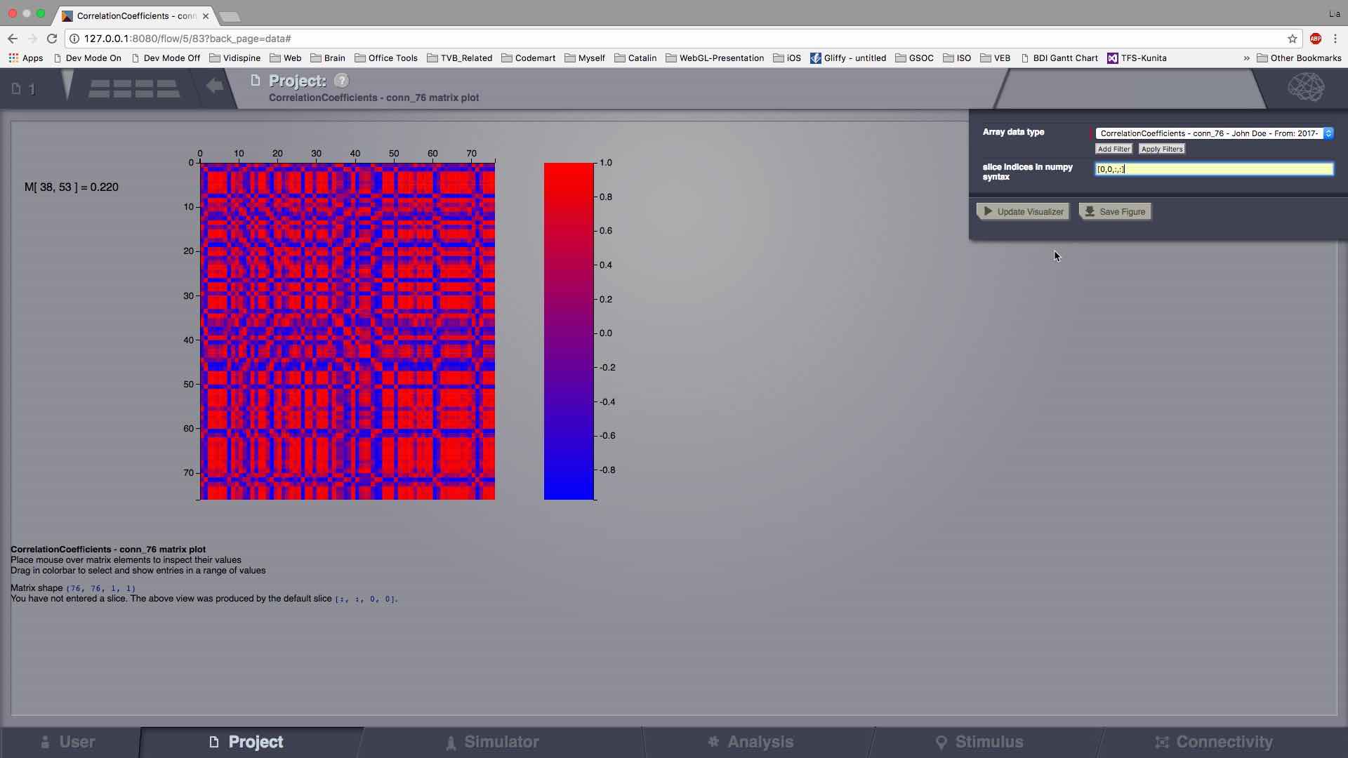
Displays the complex-cross-coherence matrix. Axes represent brain nodes.
The matrix is a complex ndarray that contains the number of nodes x number of nodes cross
spectrum for every frequency and for every segment.
The thick line represents the Mean and the colored area the SD of CohSpec.
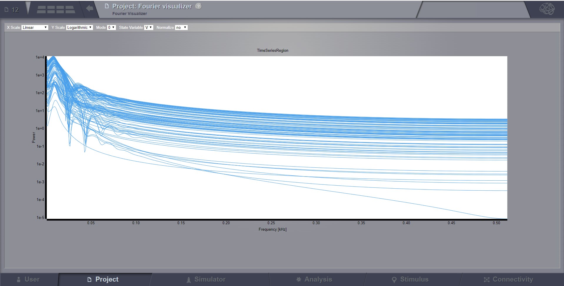
Plots the power spectrum of all nodes in a time-series.
From the top bar, you can choose the scale (logarithmic or linear) and when the resulted Timeseries
has multiple modes and State variables, choose which one to display.
After you change a selection in this top bar, the viewer will automatically refresh.
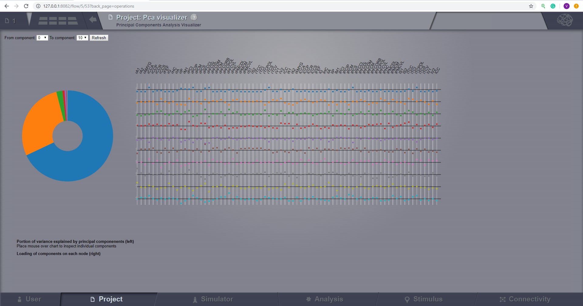
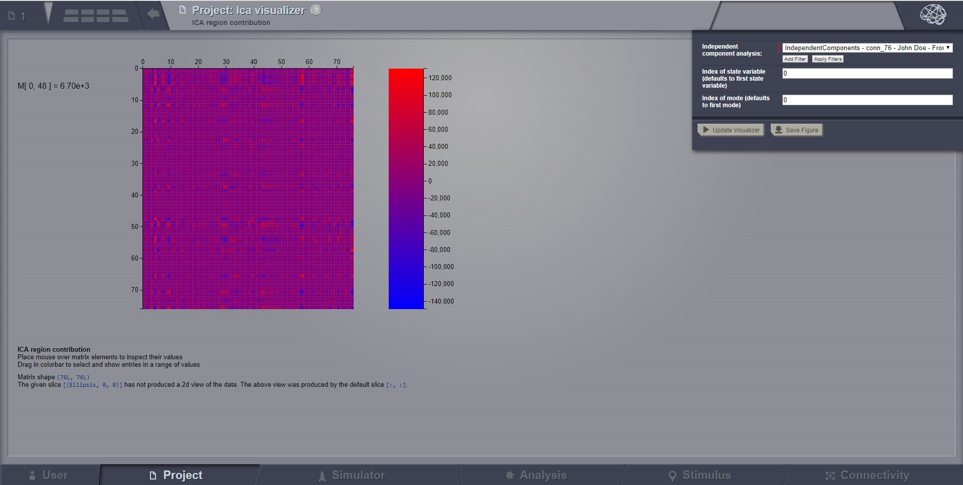
ICA takes time-points as observations and nodes as variables.
As for PCA the TimeSeries datatype must be longer (more time-points) than the number of nodes.
Mostly a problem for TimeSeriesSurface datatypes, which, if sampled at 1024Hz, would need to be greater than
16 seconds long.
Preview for Independent Components Analysis Visualizer
 icon.
icon.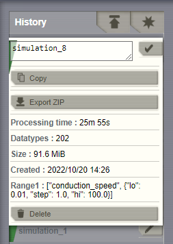
 icon when you are done writing.
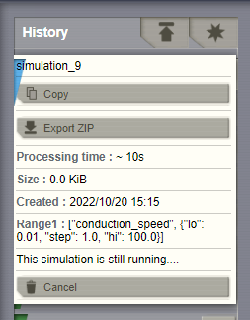
button, on this page (top of column History)
 icon next to each element.
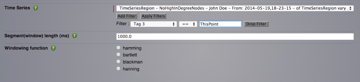
 you will be
redirected to a new page where only the currently selected visualizer is
presented. In this new page, you can click on
you will be
redirected to a new page where only the currently selected visualizer is
presented. In this new page, you can click on  in the top right corner
to access a new menu which will allow you to:
in the top right corner
to access a new menu which will allow you to: